The Challenge
OPEN approached Srijan Technologies to assist with the redevelopment of its digital content under the umbrella of www.openthemagazine.com.
OPEN magazine sought a “comprehensive redesign including presentation, information architecture, guidelines for web development and strategies for web communication.”
They wanted the website to be utilized as a marketing vehicle to help acquire prospective readers and subscriptions. OPEN’s goal is to grow not just in numbers, but also in terms of the diversity of articles and features.
The goals for redevelopment were:
- Building pioneering work in the media domain with unique features
- Fluid design with focus on effectiveness and discoverability
- Mobile-first approach, which meant that the site needed to have extremely high usability and article discoverability on mobile
The existing website was deemed “not worth the effort to update”, and they refrained from directing potential readers towards the website. Success was defined as a website that would attract users by creating a “clear call to action, to drive to a page.”
The end game was to show the essence of OPEN (the magazine itself) and convey what news stands for, how OPEN is different from other media houses, and the value of information.
Approach
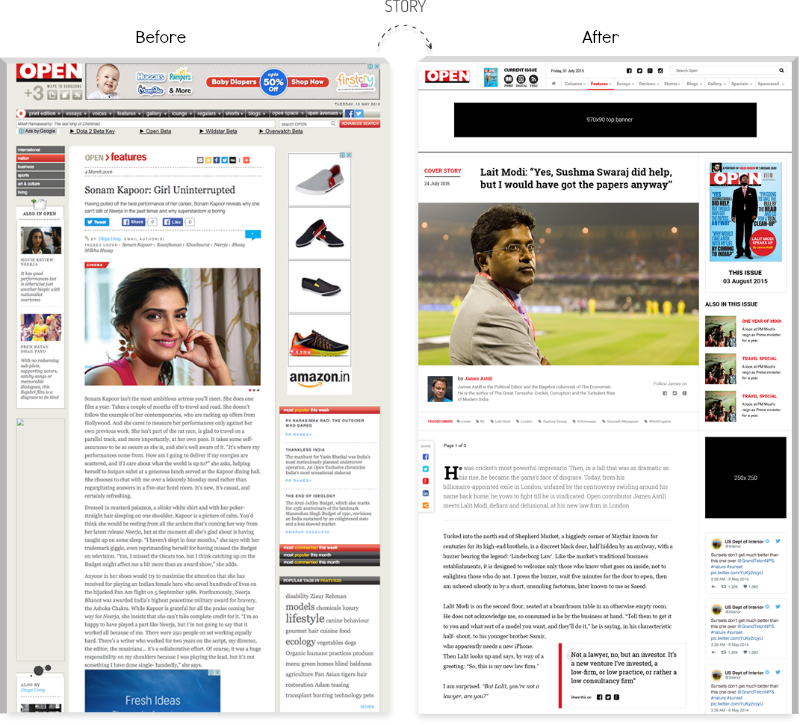
Here is how the site looked earlier. The design sensibilities were those of the 2000s, of course.
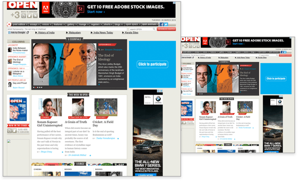
The site required not just a redesign but a complete overhaul of the presentation. Thus, we decided to analyze the user personas, create the wireframes accordingly and use Rapid prototype development approach for better evaluation.
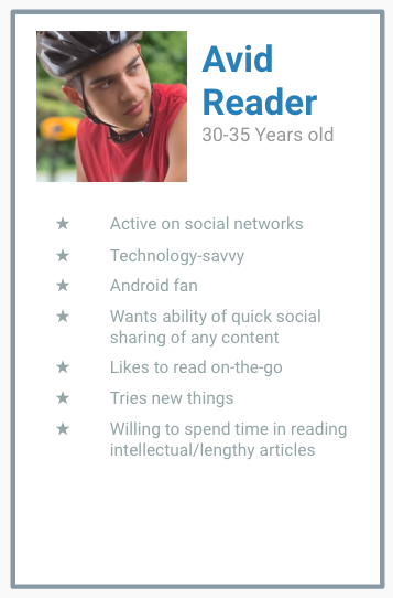
User Personas
Although we did not have direct access to the audience of the website, our conversations with the Chief Executive, the Publisher, and the editors were more than enough for us to etch out the user personas for their news portal. OPEN already knew its users very well and all we had to do was ask, to get all the information we needed.
Wireframes
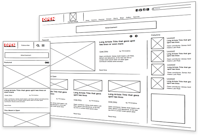
Once we knew the personas, we started work on the wireframes to help OPEN present content effectively. This exercise, more than anything else, helped us validate with the clients what content was important to them and what could be presented on the second or third scroll.
Our approach was mobile first, so we first designed the mobile version, and then extrapolated the same to show how the desktop version should look.
The Color Palette
Before deciding upon a color palette, we made a foray into the existing magazine covers to understand the design sensibilities at play in their print version.
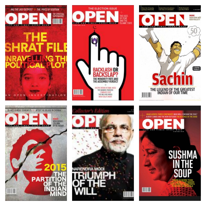
The bold use of red and black along with lots of white is what inspired us to go with a similar color palette for the website. The design also needed a lot of white space to give the readers room to breathe, and allow individual pieces to stand out.
The Prototype
Based on the covers, the use of a consistent color palette and multiple conversations with the stakeholders, we completed our first draft. We created prototypes for three main pages: the all important home page, an articles listing page, and an article page.
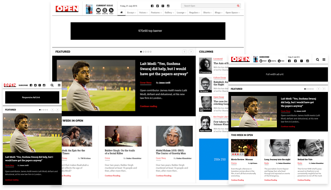
The Srijan UX team took just 5 days to create these three prototypes. From choosing the color palette to wireframing to the final prototyping, everything was completed within this short time frame.
Experiencing the Design
This was a working HTML prototype, and not just a design. This meant that the client could really experience the look and feel of the pages. It showcased how the site would behave when users interacted with it.
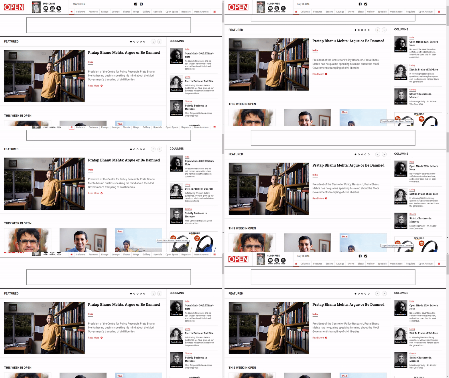
Scroll Up and Down
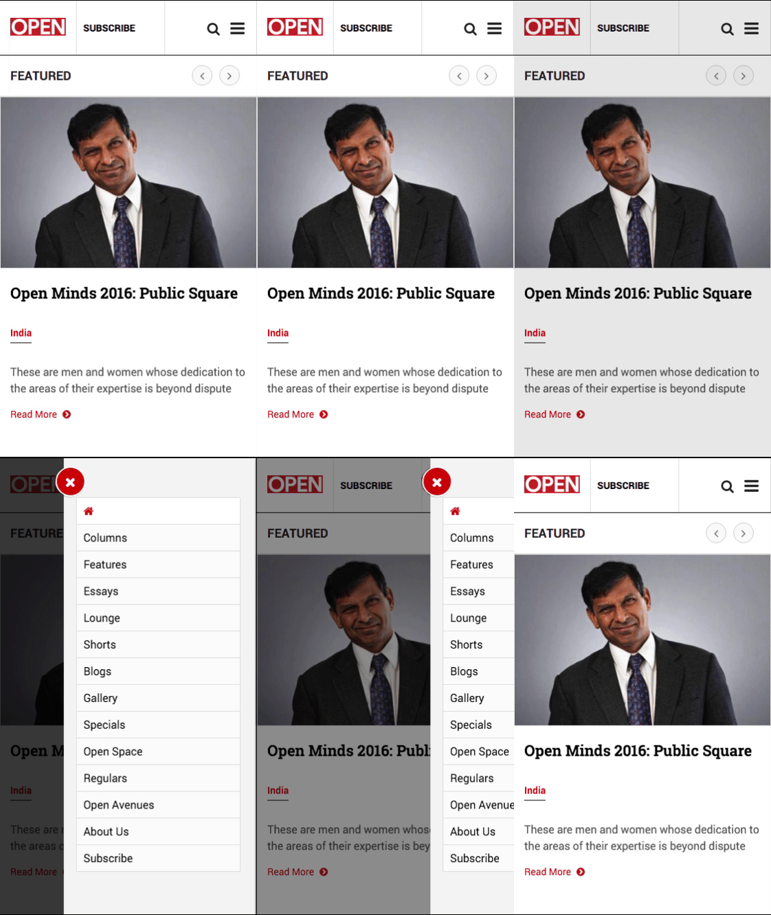
The Hamburger Menu
Some other revamps
The Client Feedback
This rapid prototyping was a clinching factor in helping OPEN quickly take a call on whether they want to go ahead with the proposed design. This also prevented lot of time and money being invested into a design that they were not completely on-board with, or hadn’t fully experienced.
We took the clients through the prototype and they they came back to us with a few suggestions. We also had a few improvements of our own to make. The first version did not have enough white space to distinguish the various content pieces. While it was an improvement as compared to the original site, it still looked a little cluttered. The black frame was eating into the space as well.
We tweaked the prototype and created another version, focused on resolving these issues and incorporating the client’s suggestions. This version made sense to everyone in the team, and was very close what the client had imagined.
They then decided to move ahead with the complete redesign and the Srijan UX team completed the project in the next 20 days.
Benefits
- The client was looking to achieve a website with minimal design. The Srijan UX team was constantly focused on that outcome and ensured that the design looked clutter-free, with ample breathing space between various sections.
- The client also wanted to retain the feel of their print version. Sourcing the color palette from the OPEN magazine ensured that this expectation was fulfilled.
- Mobile-first approach ensured that we delivered a vastly improved readability and article-discoverability on mobile
- Adding the ‘Share’ widget on both the desktop and mobile site allowed easy sharing and posting of articles
- The team also optimized image sizes to provide better reader experience across all devices
For more of Srijan's work, have a look at our other featured success stories.

