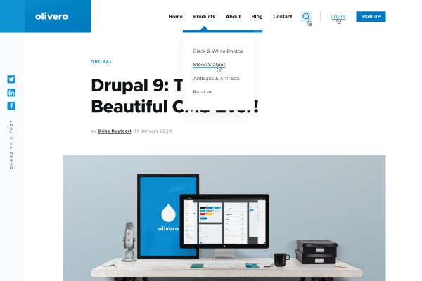
Every aesthetically pleasing website has a common ground - a good theme. An attractive theme can bring the website’s visuals to life and facilitate you to create a powerful brand identity. But that’s just one part of the story!
The website theme, beyond being beautiful, should cater to great user experiences also.
And that’s how you prepare a robust yet enticing website - maintaining design & the best usability practices hand-in-hand are the key to increase conversion rates.
The launch of Drupal 9 in June encouraged the community to make it high up on their agenda to revamp its user experience and ensure friendliness for every stakeholder - designers, editors, marketers, and developers, of course.
With an emphasis on Olivero, a modern front-end theme designed to exhibit the CMS in its best light; front-end developers can expect plenty of benefits from it.
It will empower them to bring that magical touch to the websites by utilizing their creativity along with modern tools and frameworks to define layout, styles, typography, buttons, color schemes, and many more, to drive the visuals and engagements of the website/ application.
This blog walks you through Drupal's soon-to-be default theme - Olivero and how front-end developers can leverage it for designing a great website.
Olivero and its Benefits
Olivero is going to be a new default front-end theme that is expected to be rolled out in Drupal 9.2. It is designed to give Drupal a flamboyant look and feel. Olivero is also going to be compatible with the Drupal 8 website as a contributed theme.
Currently, Bartik, a ten-year-old theme, initially created for D7, is being used. It is certainly mobile-responsive and had some outstanding features to meet D8’s mobile-first requirements. However, the development has outdated the design.
Thus, the need for a new front-end theme emerged to showcase Drupal’s strength appropriately.
|
Drupal Trivia Olivero is named after a female programmer, Rachel Olivero, an outstanding supporter/ programmer of website accessibility. Sadly, she passed away in 2019. To honor her, the Drupal community kept her name alive with this beautiful theme. The idea is to showcase patience, generosity, and inclusiveness - the qualities of Rachel that the theme should also epitomize. |
Benefits of Olivero Theme in Drupal 9
The Olivero theme is intended to give Drupal websites an eye-pleasing view apart from ensuring,
- Simplicity- declutters by eliminating the colors, effects, and visual elements that make the theme look and feel too heavy.
- Professional look - encompass all the design elements, for instance, negative space and high contrast, to grab users’ attention.
- Accessibility- designed with WCAG AA conformity in mind, from functionality to layout, to colors, all components will be accessible for everyone.
|
Drupal Trivia The blind federation conducted an accessibility test to evaluate the Olivero theme for visually impaired users. They were happy and satisfied with its design and high responsiveness. |
- Flexibility- facilitates Drupal front-end developers with multiple options to choose from - be it button styles, headers, or logo styles to text titles, and many more.
- Compatibility - supports modern browsers’ features & various engagement modes. The creators have ensured that the theme supports recent Drupal updates and features for websites such as Layout builder, media embeds, second-level navigation, and many more.
Get the Hang Of Olivero’s Exciting Features
Here are the features of Olivero that you can leverage for designing your next Drupal website-
A. Bright color palette
Websites leveraging Olivero’s color scheme will look beautiful with a base color of bright blue. Besides being attractive, it would boost Drupal’s brand recognition. Several permutations and combinations of darker and lighter colors and shades would provide website improved accessibility.
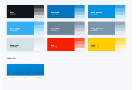
A bright color palette in Olivero theme
B. Simple and elegant forms & buttons
The forms and buttons added in the new theme are user-friendly, distinguishable, and accessible. Forms comprise a left color bar, and their labels are placed above the fields to abide by the website accessibility requirements and guidelines.
The buttons inform users about clickable action. The theme also has a filled primary button style and a secondary button style which is an outlined version of the button.
The buttons’ different modes are present default in Olivero, unlike other themes where you need to define these modes.
The four modes are- Default, Hover, Focus, and Active

Button modes in the new theme
C. Typography
Typography provides scale to maintain uniform sizing, line height, and spacing throughout the design. The base font used for body copy is 18px. The size can be tweaked for smaller screen sizes.
Consistency, throughout line height and spacing, has been a key objective when setting the scale for typography.
D. Flexible header and navigation options
Navigation options can cater to any website’s needs. The header can fold into a hamburger button menu when scrolling, allowing the user to access the menu easily on long pages.
The secondary dropdown menus are also supported by Olivero, thus saving coding efforts of developers unlike Bartik where they need to reinvent the wheel time & again.
E. Vertical Rhythm
Vertical rhythm ensures the correct spacing arrangement of the text. It calculates line-height, font size, and margin or padding to maintain equal space throughout the website.
F. UI Patterns
The header is designed flexibly so that it can accommodate the text titles and or logos of varied width and height.
On scroll down, the header will fall into a hamburger-button menu, to let the user access the menu or longer pages.
G. Site branding variations
You can tweak the theme settings to change the background color and width of the site-branding to incorporate different types of logos and long text.
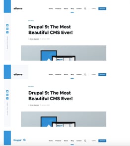
Flexible site-branding options in Olivero
H. Forms
These simple yet modern forms consist of elements that enhance the design, while still being recognizable, usable, and accessible.
The left color bar highlights the form element and labels are added above the form field to avoid confusion. Form fields have a consistent look to indicate to users that they are a form element. States such as focus, disabled, and errors have also been accounted for.
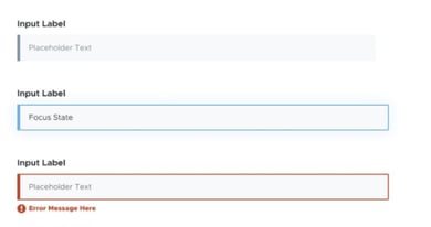
Highlighting error state in the form
I. Tables
Table divider lines are designed such that it improves readability. Olivero's theme will also support the responsive table features of Drupal.
J. Sidebar
Only one sidebar is implemented to stop competition for space on the screen. It improves readability and allows content to look more rich and prominent on the screen. Editors can showcase related posts and other types of utility blocks too.
The sidebar also offers good support and space.
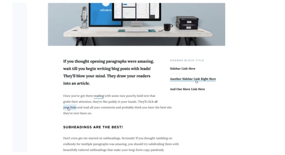
One sidebar aimed at improving readability
K. RTL Support
Olivero theme supports right-to-left languages as required by Drupal core. It also supports better display and multilingual functionality. For example, Arabic, Hebrew, Persian, and Urdu support RTL writing and so does Drupal.
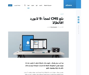
RTL support in Olivero
L. Messages
Messages intent to inform users for they need to consume important information or provide feedback on an action already taken.
Messages are visible as they are designed with bright colors to highlight the message and yet don’t mess up with the readability of the message itself.
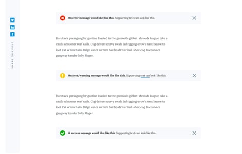
Displaying messages per their type (error, alert, and success message)
M. Breadcrumbs
Breadcrumbs in Olivero are placed near the top of the page above the page title to help users keep track of documents or websites.
A visual cue informs users about more breadcrumbs which they can access later by swiping left to right or right to left. This feature is not part of MVP.
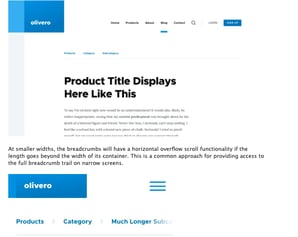
Breadcrumbs to keep track of pages
N. Color module
This feature is not part of the initial release. However, this or similar functionality might be included later.
Challenges That Olivero is Going To solve for front-end developers
Olivero is a modern theme with a magnificent look and feel. It can help front-end developers in simplifying their work. See how-
1. Lighter theme with up-to-date design elements
Unlike Bartik which used outdated graphical elements such as drop shadow and gradient, it uses a layout builder, grid system, hamburger menu, to name a few, to ensure that the site remains lightweight and responsive.
2. Low code
There is little or no coding required in CSS to determine the presentation of a web document and for adding content blocks anywhere.
There are few other scenarios that simplifies the work of front-end developers -
- Bartik doesn’t offer a secondary menu while Olivero does. This saves the coding efforts of front-end developers
- If any other theme is used, the hamburger menu is not available. Olivero theme is mobile-friendly. It encapsulates the menu automatically via the hamburger menu feature. No coding is required for it.
3. Scalability
Even on enlarging page size, it won’t break. Instead, it would give you a clear view as always. This makes Olivero more responsive.
4. Compatibility with other browsers
Bartik is not compatible with other browsers like Internet Explorer 11 while Olivero is. Front-end developers need not write code separately to ensure the support to all the functionality and features of the browsers.
5. Code compilation/ testing
Olivero has CSS Grid Layout that can handle both columns and rows. It is a powerful layout system that helps developers write code hassle-free. They can write code in a nested structure to make it compact, easy to understand and increase readability.
6. Extensibility with PostCSS Standalone technology
PostCSS is an accessible tool that empowers front-end developers to easily contribute to in the form of custom plugins.
It simplifies the writing of CSS stylesheets by keeping code simple and facilitating understanding of dependent selectors and media queries within the stylesheet.
During the development of the Olivero theme, there were several PostCSS plugins that were leveraged to make the CSS more readable and reduce the probability of breaking the page.
Conclusion
Olivero is a modern theme that is going to be the new default theme for Drupal from version 9.2. Front-end developers can use this flexible and scalable framework to improve work efficiency and create exquisite websites.
Figure out how your enterprise can leverage Olivero’s constructive features to empower your front-end developers. Meanwhile, let’s wait for this beautiful theme!
Our Services
Customer Experience Management
- Content Management
- Marketing Automation
- Mobile Application Development
- Drupal Support and Maintanence
Enterprise Modernization, Platforms & Cloud
- Modernization Strategy
- API Management & Developer Portals
- Hybrid Cloud & Cloud Native Platforms
- Site Reliability Engineering


