The answer to that question in the title is "I don't know". What am sharing here is one way to find that out: A/B Tests.
In our quest to create applications/portals that don't just look good but also help our clients meet their business objectives, we've been trying a few things lately. We just concluded one of our tests and thought to share the results and our learnings with everyone.
The web is moving from having an online presence to getting results from that presence. For this very reason, the industry is moving from design that looks good towards design that works, and we've started running tests as well to figure out what actually works. The objective of this test, apart from increasing conversions for ourselves, was to use this learning in creating better products for our clients.
For this test, we used one of the best tools available in the market, VisualWebsiteOptimizer. This tool is pretty easy to use and helps you run lots of test like A/B test, Split URL, Multivariate amongst others. Our marketing team had multiple theories revolving in our heads so we thought to test it out:
-
Left vs Right [Placing the form on the right side will give better results?]
-
Lesser number of fields [Convert more?]
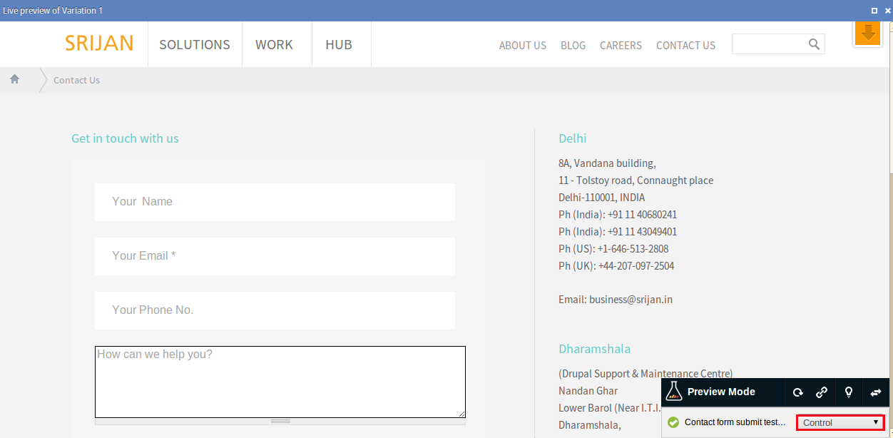
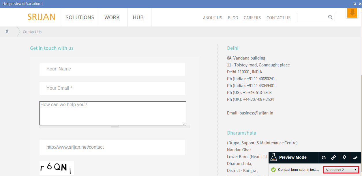
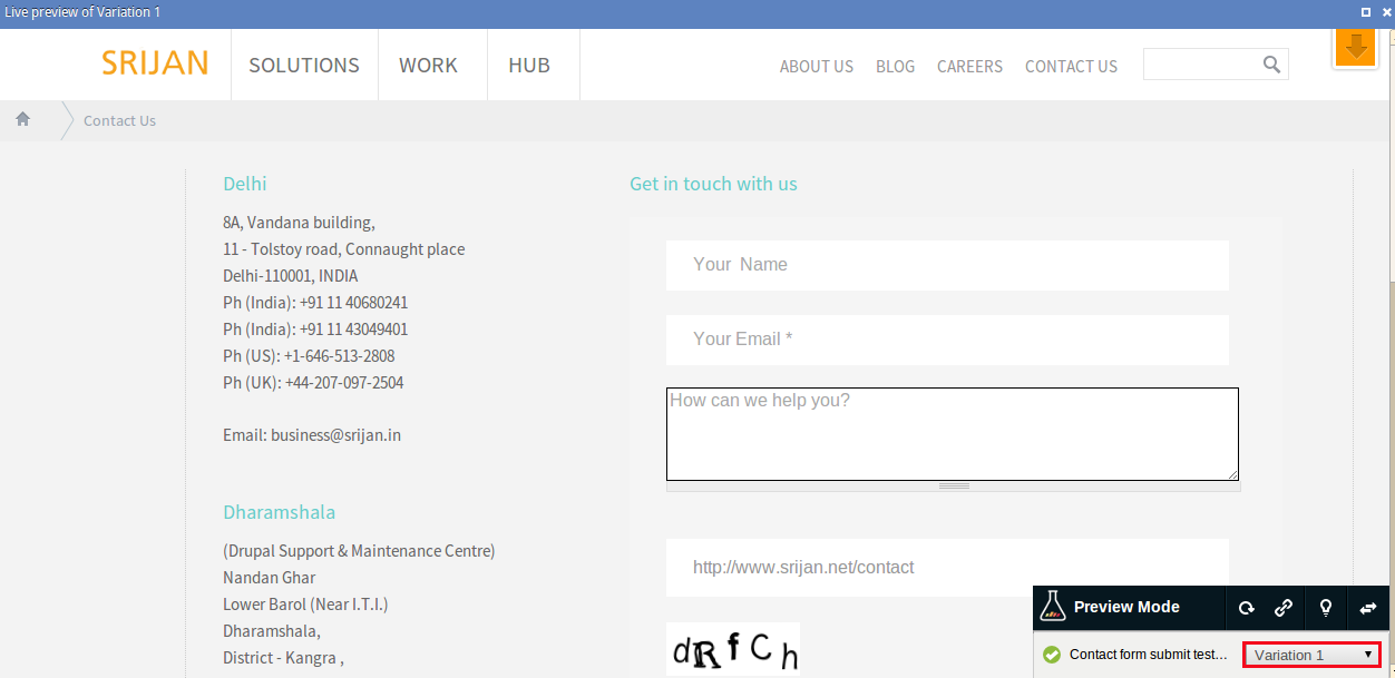
So we went ahead and created 3 variations of our landing page. In the screenshots below:
-
Control is what the original version was
-
Variation 1 had the form side switched to right. We also removed the phone number field in this variant
-
Variation 2 had the form on the same side with 1 less field (removed phone number)
Control
Variation 1

Variation 2
The Results: Much to our surprise, our tests revealed that both the theories were wrong. Our original form gave us the best results.
Conclusion: There is plenty of content around the web where people have written conclusively about right vs left, which color buttons, how many fields should a form have and so on. While you may have read lots of articles telling you what works and what doesnt, our answer is there is no right or wrong answer. What may work for us may not necessarily work for you. The best is to try it out yourself.
How can you do it? 5 easy steps
-
Figure out the objective that you want from your page
-
Create a hypothesis as to what could be the governing factors behind the conversion
-
Choose a tool like the one we recommended above. While you may say your technical team can implement this and you can save the tool costs, the reality is, often marketers get stuck because of this. The opportunity cost sometimes is much higher
-
Run the tests till you have enough data that will help you get conclusive results
-
Implement the changes you derive from your tests!
Tip: If you are (re)doing a portal/application, a good practice is to always have 2-3 versions of your most important pages, home page and the conversion page in most cases, and then test them live. Let your users tell you what they want. Eventually we're developing stuff that our users should "like", aren't we?
Have you tried tests too? What's your experience been?
Our Services
Customer Experience Management
- Content Management
- Marketing Automation
- Mobile Application Development
- Drupal Support and Maintanence
Enterprise Modernization, Platforms & Cloud
- Modernization Strategy
- API Management & Developer Portals
- Hybrid Cloud & Cloud Native Platforms
- Site Reliability Engineering


